The Nikkei Nihonga Grand Prize Exhibition
I visited “The Kaii Higashiyama Memorial Nikkei Nihonga Grand Prize,” which is held once every three years.
The award was established in 2002 by Nikkei Inc. as a program to honor up-and-coming Nihonga (Japanese-style) painters who will carry the next generation of the art world. That said, “up-and-coming” is relative—the lineup also includes veterans such as artists in their forties and fifties and professors from Tokyo University of the Arts, along with several artists who are selected every time, so there is a sense that the award’s positioning and framework aren’t fully established. Still, it was a genuinely rewarding and worthwhile exhibition. *The eligibility ceiling is said to be 55 years of age. That presumably means it also supports late-blooming artists.
Not all of them, but I’ll report on some of the artists’ works along with their comments. The catalog I bought also carried critiques of the works by those who had nominated them, and these were quite interesting (for better or worse).
Grand Prize: Takako Asami
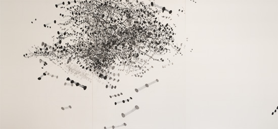
With a Grand Prize purse of five million yen, this is a fairly hefty award. Takako Asami, who splendidly grabbed that ticket—my first impression was simply, “she’s good…” There’s a mastery that makes you forget how difficult it is to paint a cherry tree in sumi ink. The three-dimensionality of the cherry tree is exquisitely expressed within an expansive space.
When I got the news, my reaction was, “Really?” I never imagined I’d win the Grand Prize. I used a real cherry tree in a park as my motif, but I usually work from garden trees like plum and persimmon, so at first I was stunned, wondering how on earth I could bring something this large onto the picture surface. I repeated my observation and sketching until I gained confidence, and working from those preliminary drawings, I painted by translating the sensation of standing before the tree into a succession of dots. Unlike plum or persimmon, the cherry’s branches are slender and supple, so I cared for the grays with fine lines and smaller dots, and also gave careful thought to how I left the blank spaces. At a certain point, something seemed to rise up out of the painting, so I finished the work while treasuring that.
Kaori Aoki
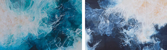
I made this work when I was a graduate student, so I’m truly delighted to be given the chance to show it again like this. I originally studied materials such as sumi ink and pigments, and my motivation is to explore how much space and life I can express within the limited world of two dimensions using such limited materials. Based on the form of a jellyfish, whose fluid, living movement you can feel directly, this work belongs to a series called “Kyōkai (Boundary).” It’s divided panel by panel, but in fact there is no left or right, no top or bottom—it’s composed so that it can connect anywhere. I present two panels as one set, but I’m mindful of a slight misalignment so it doesn’t become too much of a matched pair. I also paint in a single pass without preparing an underlayer, and weaving experience together with chance is another of my themes.
Amanatsu Aono
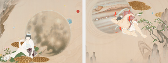
I had heard from a curator that I’d been nominated, but all I can say is that I was surprised. I feel half honored and half awed. Lately I take in information from all sorts of media, but rather than inputting the flood of information out in the world, I began to think that carefully reading old tales like the Kojiki might actually do me more good—that it might let me grasp more accurately how the roles of men and women are understood, how society is structured, and my own inner self. That feeling led me to make this work on the theme of the Kojiki. I pictured in my imagination what Izanagi and Izanami might look like. I truly enjoyed painting it.
Yuriko Asano
This was my first time seeing Yuriko Asano’s work, and it was wonderful. The paintings feel alive—there’s an emotional charge, as if they’re moving.
Artist’s comment
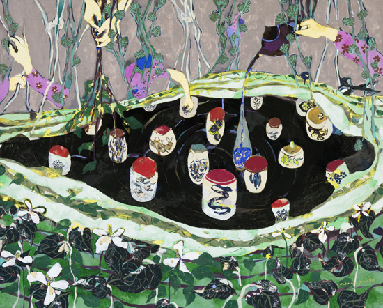
I originally painted in oils, and since the way you use paint differs from Nihonga, I was surprised to be selected. But honestly, I’m very happy. I research the old ways of life in various regions and base my works on that. For “Okami no Yakushu,” I actually asked a landlady (okami) who makes medicinal liquor at a hot-spring resort in the Tōhoku region how it’s done, and I made some myself. I express the bodily sensations I gained there through the work. I hope the sense of two different materials colliding—using both oil paint and the mineral pigments of Nihonga—is reflected as the energy and strength of the land.
Kei Arai
A professor at Tokyo University of the Arts—far from up-and-coming, he’s someone who has entered the ranks of the veterans—but I looked on thinking, “he really is good… it’s almost unfair…” I surrender.
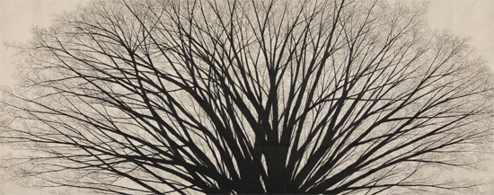
This is a work in which I completely changed my style from before. I presented it last autumn, was nominated soon after, and was selected, so I’m very grateful to be introduced like this. Previously my expression centered on the pictorial, but from this series I took the plunge and shifted direction toward something more bodily and gestural—building the work out of an accumulation of drawn lines. Without any underdrawing or sketch, I translated the patterns of how branches divide into brushwork and painted on and on with a rhythm my body had memorized. The branches divide and spread, and spread, and where they finish spreading is the edge of the picture. I decided only the ceiling height in advance; I painted this work without deciding the size of the picture surface.
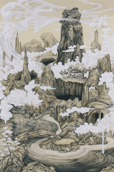
Ryōzō Katō
A work that is simply very long horizontally, like a picture scroll (emaki). It expresses an angle of view that exceeds the human field of vision, and it has more flavor when you view it while moving than when you stand back.
I’d been nominated several times, but this is the first time I was selected. In terms of age this year was my last chance, so honestly I feel relief along with joy. In the era when I started painting, the mainstream movement was to broaden the scope of Nihonga, and no one paid attention to its origins. When I turned my eyes to those origins, what I found was “realism that depicts thought,” not merely what one sees. Then, digging deeper into where that thought looked and what it envisioned, I arrived at Chinese landscape painting (sansui). I paint by boosting the image of real nature together with that of society as a whole—not just my own.

Aya Shiina
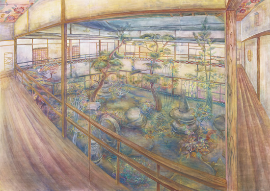
A masterful work that harnesses distortion and pulls it off. Adopting a courtyard as the motif was surely a factor in its success, too.
As for being selected—surprise and joy, and… the surprise is greater. This work is one of a series I paint by touring the old pleasure quarters (yūkaku) that remain here and there across the country. Rather than the beautiful places that could be called the royal road of Nihonga, I deliberately go to such places and paint them, thinking about the interest to be found in things that seem about to be forgotten and about the meaning of their existence. When I turned my sketch directly into a painting, it took on a distorted, fisheye-lens quality. Perhaps the impression of transcending time and space that I felt when looking at an overgrown, untended garden unconsciously came out as distortion.
Takeshi Tanaka
Takeshi Tanaka is an artist who gives me the feeling he’ll become big going forward. In his recent show at Kobayashi Gallery too, I felt the power of works that make a large canvas look small.
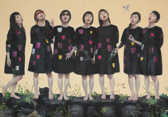
The work I made this time, “Seishō ~Kami 7 no Uta~,” takes nanpuku (calamity and fortune) as its theme and depicts seven women singing atop black sandbags.
The sandbags overgrown with weeds are the decontaminated, contaminated soil spreading across Fukushima and elsewhere. They’re sometimes called black pyramids, but they have now begun to deteriorate, soil is leaking out of them, and weeds have started to grow. I grasp that present reality as “calamity,” and above it I painted seven women modeled on the Seven Lucky Gods (Shichifukujin), the symbols of “fortune.” The clothes they wear have as many pockets as there are nuclear power plants in Japan. I approached the work with the meaning that although every “fortune” that will come to us from now on is haunted by such “calamity,” we should still be able to wish for “fortune.”
At the risk of sounding half-hearted, I believe that when it comes to nuclear power, one shouldn’t lean too heavily on extreme answers of “right” or “left”; it’s a problem we must keep thinking about, caught in between, until we die. Within that, I don’t mean to use this work to say “nuclear power is evil!”—much less “it’s good!” Rather, I wanted to express the present reality and the resolve of having to go on living while accepting this world surrounded by nuclear power and the “calamity” and “fortune” it has produced. To give that thought form, in “Seishō ~Kami 7 no Uta~” I took Ōkyo Maruyama’s “Shichinan Shichifuku-zu” as my starting point, while also referring to Ryōhei Koiso’s “Seishō” and “Shōten no Inori (Prayer of Ascension)” of the Monument to the Twenty-Six Martyrs of Japan, among others.
From the personal-history matters around me to the social matters surrounding the entire nation, calamity and fortune exist at both the micro and macro scale. To express that as painting is my work.

This “Seishō -Kami 7 no Uta-” is a work that evokes Ryōhei Koiso’s “Seishō.”
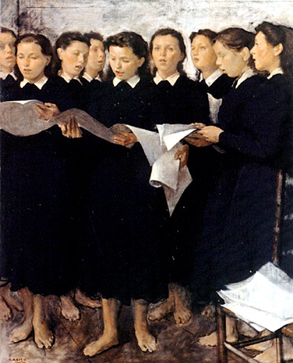
It depicts seven women modeled on the Seven Lucky Gods singing cheerfully atop sandbags that appear to be contaminated soil. The costumes have 55 pockets attached—apparently the same number as the nuclear reactors in Japan. That really is a lot.
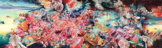
Rena Yaho
Maybe it’s just me, but Rena Yaho’s distinctive sense of color feels less like painting and more like the color emitted from a video monitor. That vivid, eye-catching use of color shows a presence unlike any other.
When I read the newspaper and learned I’d really been selected, I was startled and, though I didn’t quite understand why, I cried. I was so happy that I truly resolved to keep working hard. The title “Ubusuna” comes from ubusuna, the word for the land where one is born. While staying on the island of Mallorca in Spain, as I faced the mountains, the air, and everything there day after day, I wanted to paint the strange sensation of becoming one with that land—and that was the start of the work. I usually take familiar things as my motifs, but I weave in things whose impact I couldn’t forget, like the mussels I ate in Spain and the pomegranate I bought at the supermarket.
Kōhei Nagasawa
I’ve long worked on the theme of urban landscapes, and this work was painted as the culmination of completing my doctoral course at university. Within a style of relentlessly painting cityscapes—every single building, one after another—I felt that the larger I made it, the more powerful the picture would be, so I produced it at the largest size the physical environment allowed. When people think of Nihonga they think of flowers, birds, wind, and moon (kachō fūgetsu), but for me, born and raised in Tokyo, the city’s scenery is more familiar than grand nature—it’s something that exists naturally to me. Seen from above, areas with thorough urban planning form a grid, but out in the peripheries beyond it the city sprawls on its own and grows chaotic. That is also very organic, and I feel it’s the part where a “nature” created by humans is represented.
Miwa Nakazawa
A work with real character, whose simple use of color nonetheless has the power to draw you in.
I was deeply moved to be selected for an award I’d admired since my student days. About six months before I set out to paint this work, I learned I was pregnant with my second child, but right around the same time my mother collapsed… Being born, possibly dying—having to think earnestly about life all at once—I felt a pressing urgency that, in order to move forward, I had to give some kind of form to what I was feeling. This isn’t a case of painting because I wanted to; it’s the first work I painted with a genuine thematic intent, while confronting myself.
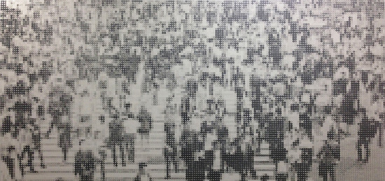
Yukinori Yamamoto
I too was drawn in, and I sympathized with his comment touching on the catalog; there’s a fascination in his relentless rendering of these one-yen coins in light and shade and in embedding that into the title as well. This was the work in front of which I myself moved around the most.
One of my formative experiences with art was when a mentor in high school showed me the catalog of the Nikkei Nihonga Grand Prize Exhibition. Being selected this time brings joy and will, I think, nourish my future work. Using a technique called frottage, the crowd of figures I drew with the one-yen coin—the smallest unit of currency—represents the image of humanity in a stifling society. Combining the digital-like expression of lining up one-yen coins with the analog-like expression of rubbing, I painted this work while thinking about where present-day humans are really headed. When you step back, you can see what this picture depicts. I’d be grateful if viewers also sensed the importance of stepping back rather than grasping things nearsightedly.
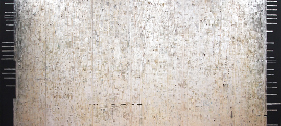
Asami Ga
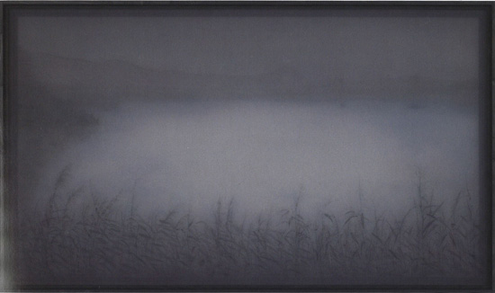
A work that evokes “Moku (Silence)”—or rather, darkness. Yet that darkness is deep and complex, with a reality in which color seems to emerge from within the shadows.
I have few opportunities to show in the field of Nihonga, but my work is based on the East Asian art and Nihonga I’ve studied until now, so being selected this time is an encouragement and a joy. I create a single work by layering many sheets of thin, translucent fabric drawn on with sumi ink, colored inks, and the like. I make pieces that respond to the exhibition space—some hanging from the ceiling, some placed on the floor—but this time I composed it as a single picture within a single plane. The lighting of the venue, the hues of the paint and ink, and the shadows—the hues and darkness that shadows create are also elements that generate depth. Taking all of that into account, I created the work while imagining its final form.
I’m looking forward to the exhibition three years from now, too.